Portrait photography is photography of a person (or people). It has expression and a mood it sets. Portrait photography can relate to profiles because a profile is a photograph of someone at a side angle. Portraits and profiles are both of people, but the angle that differentiates them is very crucial.
Silhouetting also relates to portrait photography because a silhouette can be of people too. A silhouette is an outline.
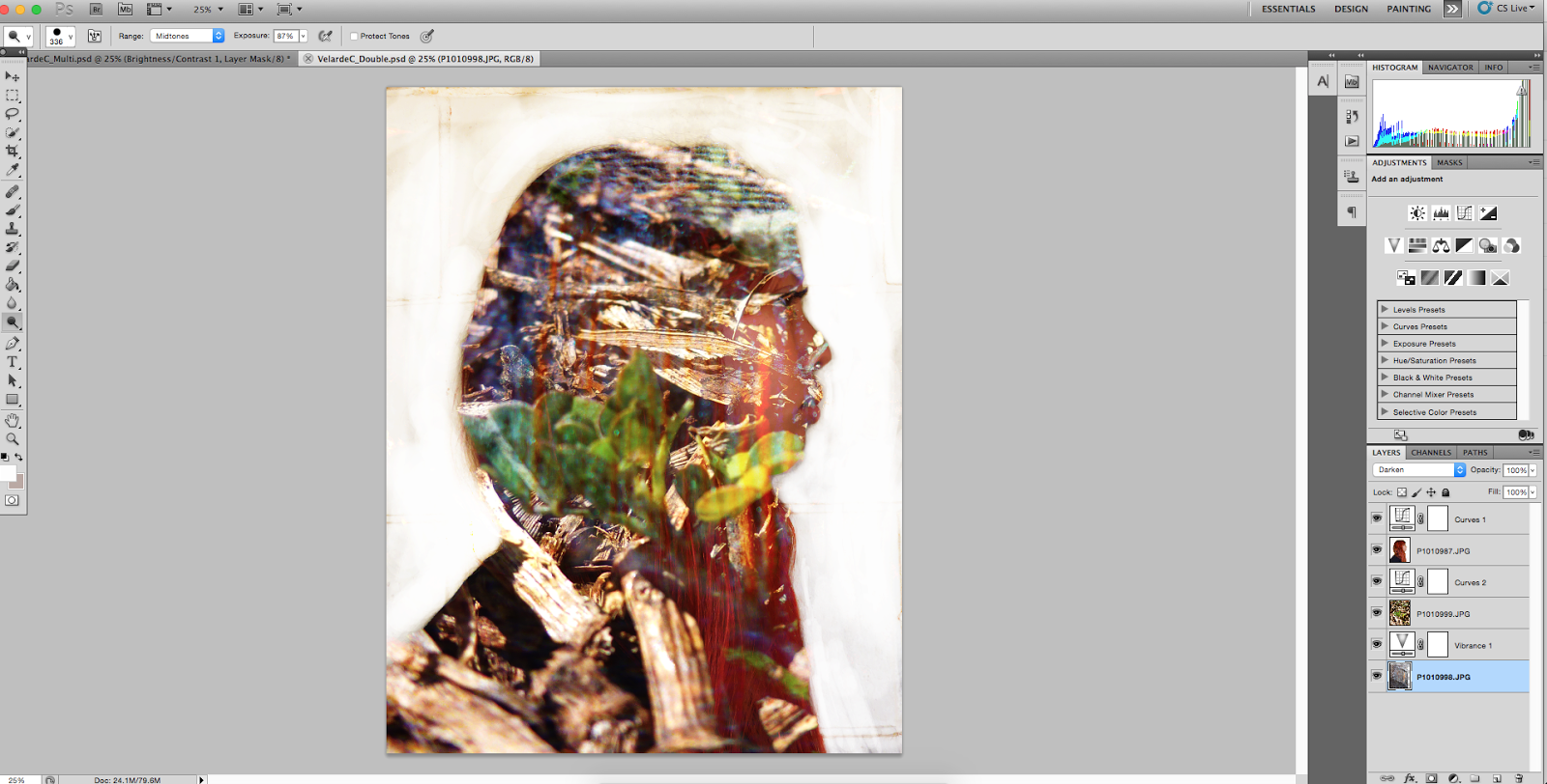
Double exposures are very entertaining to make. It's an interesting form of photography, in my opinion, and I think double exposures are very beautiful and 'cool.' How to create a double exposure portrait in
Photoshop goes as following:
- Load your photos into a stack in Photoshop: File> Scripts> Load files into stack, then browse your photos and select the ones you like best. I had three photos in my double exposure; a profile, and two textures.
- Crop your photo. Use the crop tool and make sure the crop restrictions are set to 8.5 x 11" 300 px/in. Its important that you make sure all of the space between your profile subject's and the edge of the frame are equal.
- Use the dodge tool (opacity 100%) to make all of the photo that isn't your subject white. (Make sure your profile is the top layer and that its selected while dodging) you can also do this with the paintbrush tool, if you prefer.
- Once the area around your subject is light enough to your liking, you must blend your photos together. Double click one of the textures and the click on Blend Mode> Screen. Repeat with your other texture.
- Change your color tone. Layer> New Adjustment Layer. Now you can explore the different coloration settings and adjust them to your liking!
 |
| Example 1 |
- Dont forget to save your work! File> Save As> Name your document + save as JPEG> Save
 |
| Example 2 |
Example 1 was a practice double exposure, so I didn't think much when choosing my textures, in all honesty. I just had in mind the message I wanted to put out. The textures I chose were the grass and my ripped jeans. I chose to place the ripped black fabric photo on my head to represent how my mind is sort of dark and tarnished. I placed the grass over my whole body to symbolize how on the outside I seem very ordinary. So my overall message for Example 1 is how I'm interesting on the inside, but seem bland on the outside. I could've improved this piece by making the colors a bit more abstract. Example 2 was my final project. The textures I chose were piano keys and a chain link fence. I placed the piano keys over my whole body to describe how music is my life. My life revolves around music. I place the chain link fence over my face/head to represent how my thoughts are sort of..
caged in. It symbolizes about how I don't like to talk about my real feelings or thoughts, how I feel like no one wants to listen. I could've improved this piece by once again, making it more abstract. Although I really like the realism in my work, everyone else that was assigned to this project had abstract work, so I feel a bit singled out.


Cool blends
ReplyDeletenothing bad!
cool message about your self
Thanks(:
DeleteMy favorite part of your work is the piano that blends in!:)
ReplyDeleteYour message works because you can clearly see the symbols.
Your quality is really great!
thank youuuu(:
DeleteMy favorite part of your work is your symbolism.
ReplyDeleteYour message really works well since we can tell what your two images are.
You can improve it by leaving it stay as is.
thank youuu (----:
DeleteCompliment:Both images can be seen very clearly
ReplyDeleteCriticism:A part of your back kinda blends in into the background
Compliment:You merged the fence and the piano so that it's placed really well and it makes sense
Aha thanks for the commment ! I purposely blended it that way, but thanks for the critisism !!
DeleteGreat practice and awesome final!
ReplyDeleteNothing is wrong with this!
I love the meaning of your symbols!
Thank you(-:
DeleteI really love how opake the colors are!!!
ReplyDeleteNo comment.{PERFECT}
I love the way your paragraphs are written.
Thank you ^-^
DeleteI love the two symbols you chose.
ReplyDeleteI dont see anything wrong with this!!!
I love how the two symbols fade and how much it matches you.
thanks !!
DeleteI like the picture of the piano!
ReplyDeleteIn all honesty I think your image is perfect!
I like how you put the fence over the piano.
thank youuu(:
DeleteI like the message your two symbols said
ReplyDeleteI have nothing bad to say!
I love love LOVE your overall double exposure!!
Thanks(:
DeleteCompliment: I love how your image has a strong and great message
ReplyDeleteImprovement: Nothing can be improved it's perfect
Compliment: I love the way the fence and piano overlap perfectly
thank youuu !
DeleteMy favorite part of your work is how clearly we can see both symbols and how well they both describe you.
ReplyDeleteIn my opinion, your message does work because the way you describe it really makes me understand how you feel and how it is symbolized.
I really like everything about it and I don't see anything that can be improved.
Thanks !
Delete